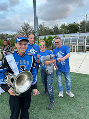
SCRIPT FOR MUSIC VIDEO And this is me, Bond Benson. I was born in Chelney Russia on June 1st 2006, but James Bond is from England. I like sports because I love all the action packed drama. James Bond loves car chases. And this is James Bond. James Bond likes martinis, shaken not stirred, but Bond Benson like dogs. They are amazing and they love you no matter what. He love the breed giant schnauzers because of how playful they are and they love to guard your house. Bond Benson likes music because it uplifts in troubling times and get my mood up. Bond Benson loves playing drums, James Bond likes driving fast. James Bond likes working undercover, but Bond Benson is in two bands. He is pretty good at it! ...


Comments
Post a Comment